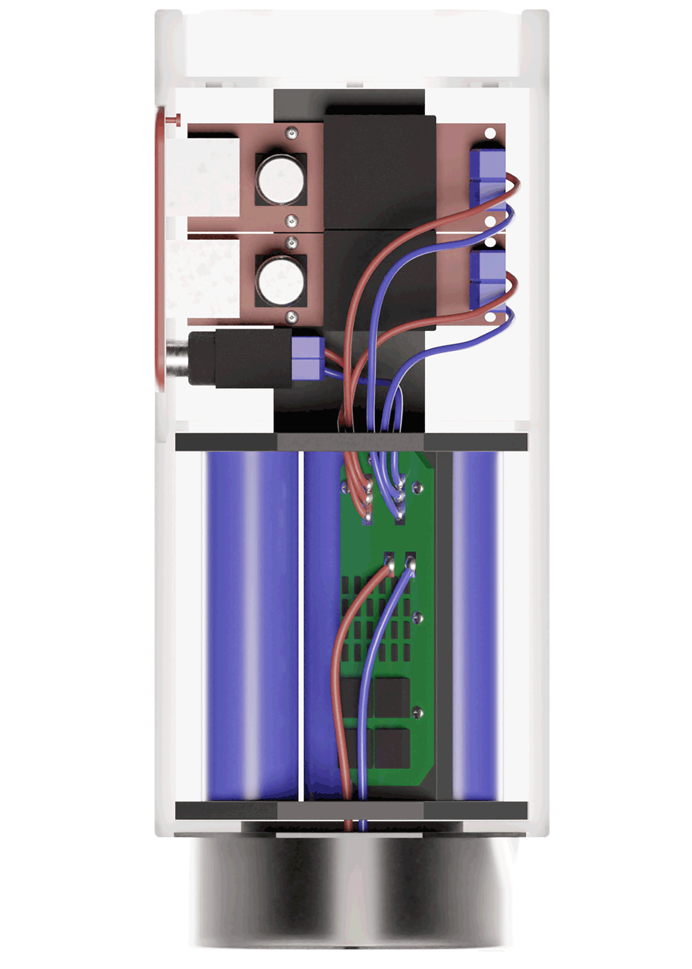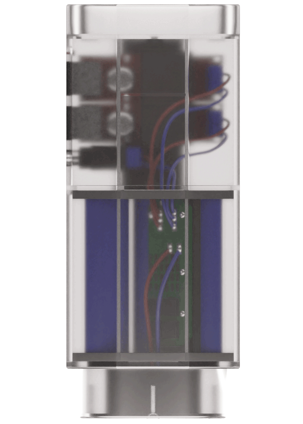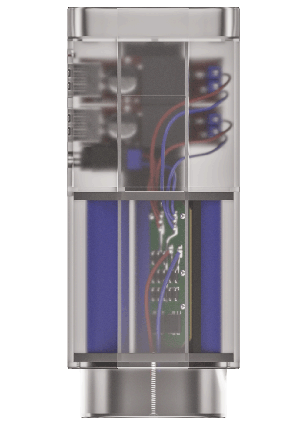
While revisiting a few old projects of mine, I came across an old power bank device. We originally created it to be manufactured with low cost and used with a minimum of parts, yet with a lot functionality. It features two USB ports to charge phones or other USB driven devices, and a specific port to be used with all kinds of extra periphery that needs higher voltage than the 5V USB ports can deliver.
More a less year of time lies between the original work and the revamping of the visuals. So let's take a look at how my perception of product presentation through renderings has changed.
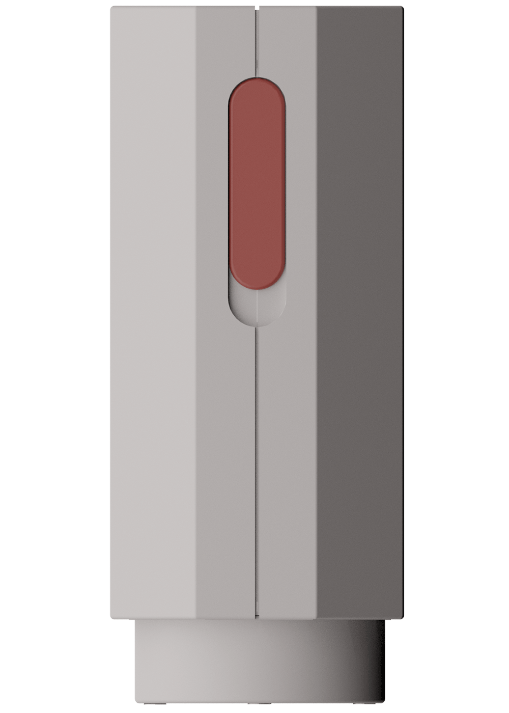
Here we can see one of the original visualizations. It works charmingly to represent the shape and a bit of the material, but there are a few downfalls. One, for example is that we can actually see through the two main pieces if we look closely below the reddish latch.
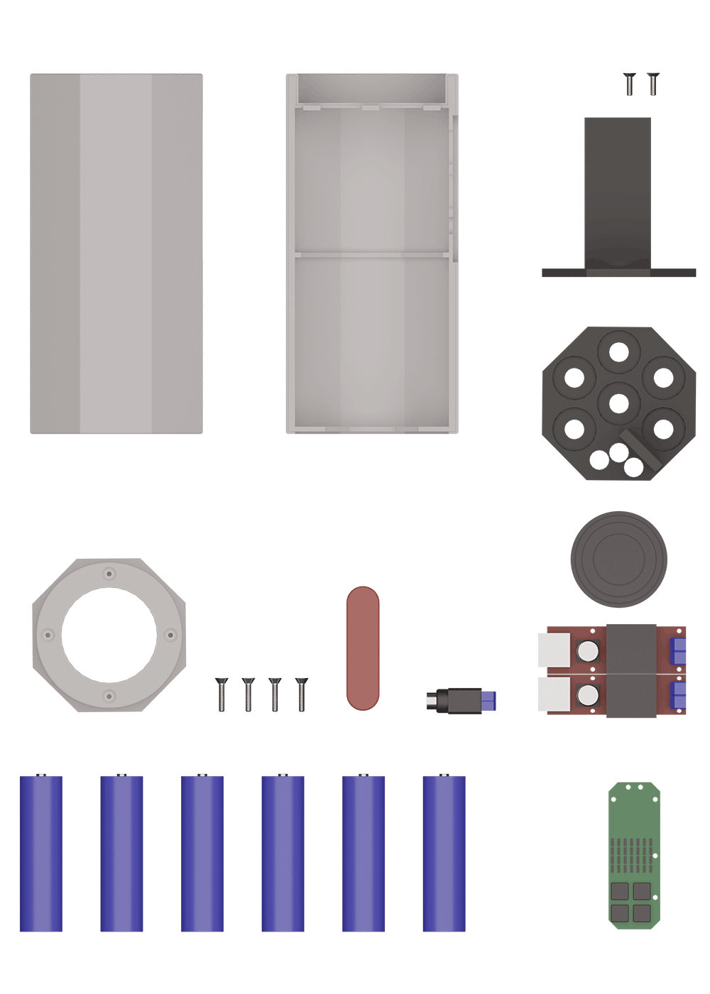
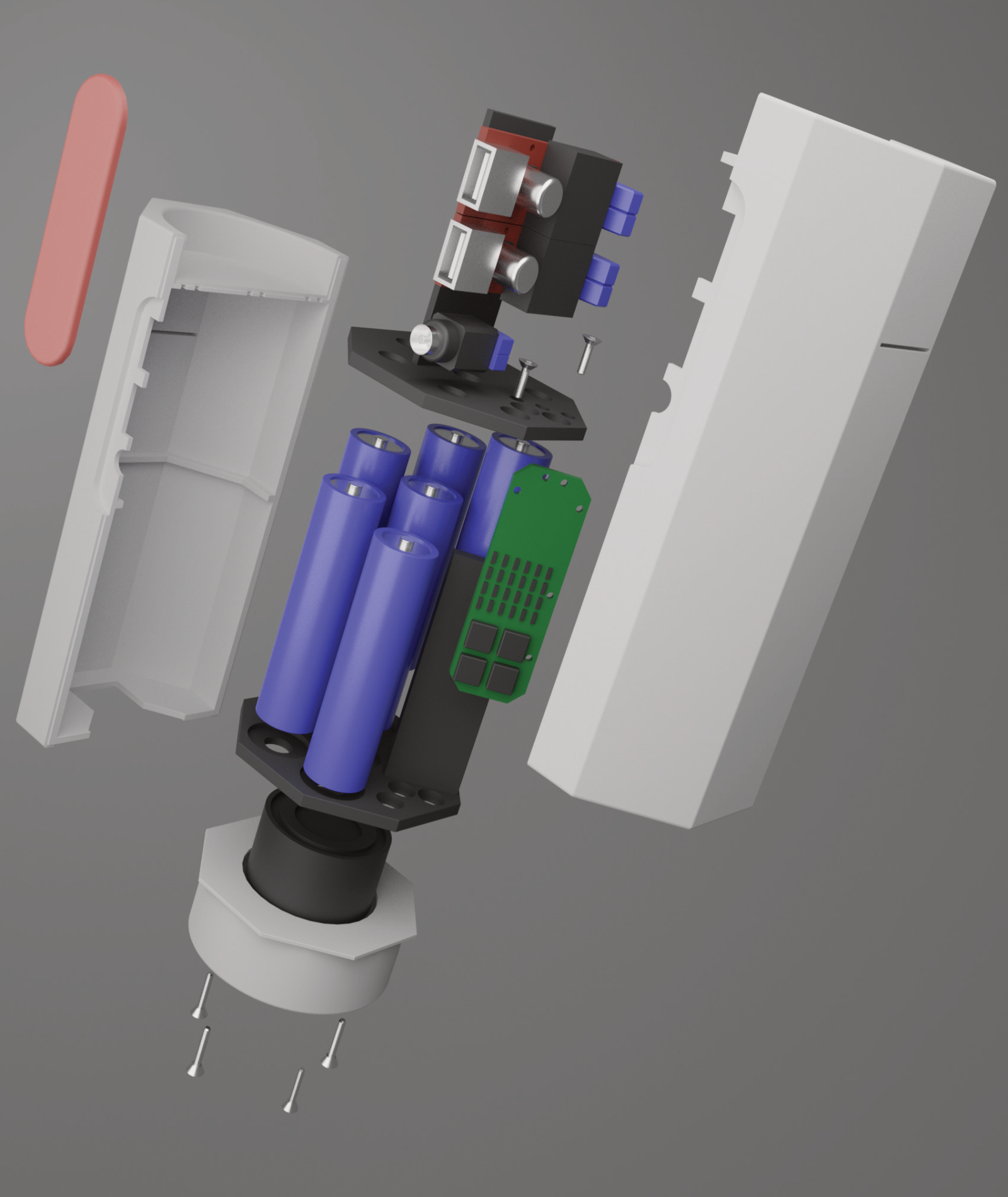
I'm a huge fan of flatlays! To show off all the major parts a product contains, a flatlay is definitely a way to go. I also did an explosion view to show how these parts work together, since this is always an important aspect when your're talking about function.
When I looked at these product pictures after about a year, I quickly noticed a lot of things I would do differently today and decided I would take a look at making things better. One of the biggest problem, in my opinion, was the total lack of detail in most parts.
I thought about what changes I would like to make for a while. Originally, I just wanted to revamp the single parts and make it look more polished in general but keeping the explosion-view just like it was.
However, while I was working on it I realized that I would love to show the internals in a more real context. The idea of showing them inside a cutaway was born. This cutaway idea then shifted towards a transparent render. Even though you can't see the details so easily I wanted to make it just right and added more and more details in the electronics to really show how it would look like if we had produced it in a clear housing.
I think it looks really powerful this way! You can see the shape of the battery container and instantly realize how each component has its place in the volume.
But as always it's diversity which is so impactful at presenting ideas so with another product, another visualization might be key.
